Branding
Welcome to Ostratto's Brand Guidelines. This resource provides clear guidance on our branding - including logo usage, language, and the assets you need for your marketing and communications efforts. Let’s keep our brand consistent and true across everything we create.
The "Ostratto" name, the Ostratto logo, and other Ostratto trademarks, are property of Ostratto. These guidelines are intended to help our partners, resellers, customers, developers, consultants, publishers, and any other third parties understand how to use and display our trademarks and copyrighted work in their own assets and materials.
The logotype is our most important asset. The logotype consist of our symbol and wordmark. The logotype should always be treated with respect and placed prominently in communication and on products.
Logo Variables
The logotype is available in various orientations, one is the vertical (stacked) logo - which is the primary version - and others are available below.
Our logotype is available in black and white (positive and negative). The white logotype on Ostratto Ice White is our Primary Application.
Logo Alternatives
The Ostratto logo alternative is only to be used for specific purposes, for example internal documents. But this is to be specified by the internal management team.
Safezone
The clear space around the logotype is the middle circle size of the Ostratto mark.
Logo on Image
Ostratto logos on imagery should be applied for maximum clarity and consistency. Use the logo on light and dark imagery as specified to maintain contrast and visibility across all visuals.
Incorrect Usage
- Do not change the logo to an unspecified colour or combination of colours.
- Do not scale, stretch, or resize the logo disproportionately
- Do not use the logo in any orientation other than horizontal
- Do not attempt to recreate the logo
- Do not use the logo as a repeated pattern
- Do not apply graphical elements, such as drop shadow or glow
- Do not alter the composition of the logo
- Do not use the logo colour on a background without proper contrast
Co-Brand & Partnerships
For the co-branding & partnership logos, the minimum clear space on all sides of the logo should be the height of the lowercase "O" in Ostratto. This includes the space between the two logos divided by a 1.5pt black line in the middle dividing the two logos.
The Partner logo should be the height of the larger blue circle in the Ostratto mark.
Colour is a powerful tool in establishing a brand identity, evoking emotions, and ensuring consistency across all communications. Ostratto’s colour palette is carefully curated to reflect our professionalism, trustworthiness, and modern approach.
Primary
Secondary
Primary
Primary Colours
Our primary colours should mainly be used for backgrounds, colour fields, and other graphic
elements, including brochure covers, page dividers, promotional folders, and more.

Ostratto Ink
#161515
R - 121 G - 121 B - 121 C - 77 M - 69 Y - 61 K - 86

Ostratto Ice White
#e8f3fc
R - 232 G - 243 B - 252
C - 11 M - 2 Y - 0 K - 0

Ostratto Dark Blue
#042e5b
R - 4 G - 46 B - 91
C - 100 M - 84 Y - 38 K - 29
Secondary
Secondary Colours
Our secondary colours should mainly be used for highlighting, colour fields, and other graphic elements, including marketing materials and social media assets.

Ostratto Horizon
#0085f2
R - 0 G - 133 B - 242
C - 79 M - 46 Y - 0 K - 0

Ostratto Blue Sky
#5faaf6
R - 95 G - 170 B - 246
C - 56 M - 24 Y - 0 K - 0

Ostratto Frost Blue
#8ec3f8
R - 142 G - 195 B - 248
C - 40 M - 13 Y - 0 K - 0
Brand Gradient
Our brand gradient is a key visual tool, adding depth and dimension to our identity. It is designed to be versatile and impactful, while remaining consistent across applications. This gradient can be used as a backdrop for digital and print materials, adding visual interest to backgrounds, overlays, and key graphic elements.
Use the gradient thoughtfully to enhance the brand’s presence and maintain cohesion across all touch points.

Typography plays a crucial role in maintaining Ostratto’s professional and consistent brand identity. Our typefaces are carefully selected to ensure clarity, readability, and a modern aesthetic across all communications.
Primary
Secondary
Primary
Our primary typeface is Montserrat. It is available on Adobe Fonts with an Adobe Creative Cloud subscription and also available via Google Fonts.
As our primary typeface, it should be used on all internal materials. Black and Light weights should be use for External use i.e. marketing material.
Montserrat
AaBbCcDdEeFfGgHhIiJjKkLlMmNn
OoPpQqRrSsTtUuVvWwXxYyZz
1234567890
!&@#£$%*()&?;:.,
Light Regular Semi-Bold Bold Black
Aa
Secondary
Our secondary typeface is Open Sans. It is available on Adobe Fonts with an Adobe Creative Cloud subscription and also available via Google Fonts.
As our secondary typeface, it should be mainly for body copy rather than headers.
Open Sans
AaBbCcDdEeFfGgHhIiJjKkLlMmNn
OoPpQqRrSsTtUuVvWwXxYyZz
1234567890
!&@#£$%*()&?;:.,
Light Regular Bold
Aa
Typesetting
- Headings: Montserrat: Black, Leading: Auto Tracking: 0 (Default)
- Sub-Heading or emphasised text: Montserrat: Bold, Leading: Auto Tracking: 0 (Default)
- Paragraph Header: Open Sans: Bold, Leading: Auto Tracking: 0 (Default)
- Body Copy: Open Sans: Regular, Leading: Auto Tracking: 0 (Default)
Line spacing: the use of automatic line spacing is recommended in all cases.
1. Main Heading
2. Sub-Heading or Emphasised Text
3. Paragraph Header
4. Orepel et aribus dictinihilic te que volo eum voluptatur sapit atet ati. Utatiantiusda doloris escid ut mo in nonsero escipsam repudi ommoloreius accus et aut voluptat.
Aboreptatem. Adipsam usapici enimintet reped maionectat. Beat iusdae vel earcia cus re, ulpa aut laccuptasin cum eatiore ctendi od unt, ut dolupta temperum quos resse int et aut plignis de moditaquam eum iliquunt.
Uptat faces vide cus et, nonseque lique moloria quam sita nosandamus pro ium facererum rerfernat. Ur, volorep tiorrum et fugit omnimentiur, ut estiasim qui con nisint oditaquam harchil istiam fugia duciis dolorum, omniasp iendio.
Nam nones et iligend ellabor epernat aut latquod quis vollatiatia con pelest, optatet odit volupicae moloreh entio. Muscien ihiciis esequam usciditectem quatur aris earcit liti sequi te nullabo restium quaspic tendae aut et quiandae parciet esequas.
Combining Typography Weights
Our typeface is available in five weights: Light, Regular, Semi-Bold, Bold, and Black. A clear hierarchy enhances readability and emphasises key messages. Variations in position, weight, size, capitalisation, and colour help establish this structure effectively.
If Montserrat is unavailable, use Open Sans as an alternative. For improved contrast, opt for Open Sans Regular for body text instead of Montserrat Regular, ensuring clarity and consistency across all applications.
Family Weights
Montserrat Black
Montserrat Bold
Montserrat Semi-Bold
Montserrat Regular
Montserrat Light
Montserrat Black 50pt
This is a Headline
Montserrat Bold 36pt
Place a Title Here
Montserrat Semi-Bold 18pt
Place a Title Here
Montserrat Regular 15pt
Lorem ipsum dolor sit amet, consectetuer adipiscing elit, sed diam nonummy nibh euismod tincidunt ut laoreet dolore magna aliquam erat volutpat.
Open Sans Regular 15pt
Lorem ipsum dolor sit amet, consectetuer adipiscing elit, sed diam nonummy nibh euismod tincidunt ut laoreet dolore magna aliquam erat volutpat.
This is an example A4 print format serving as a guideline for structuring documents. Adjustments can be made at the discretion of the designer, ensuring appropriate scaling based on content length and document size. If the document is smaller, formatting should be proportionally reduced while maintaining readability.
For optimal legibility, body text should not be smaller than 7pt.
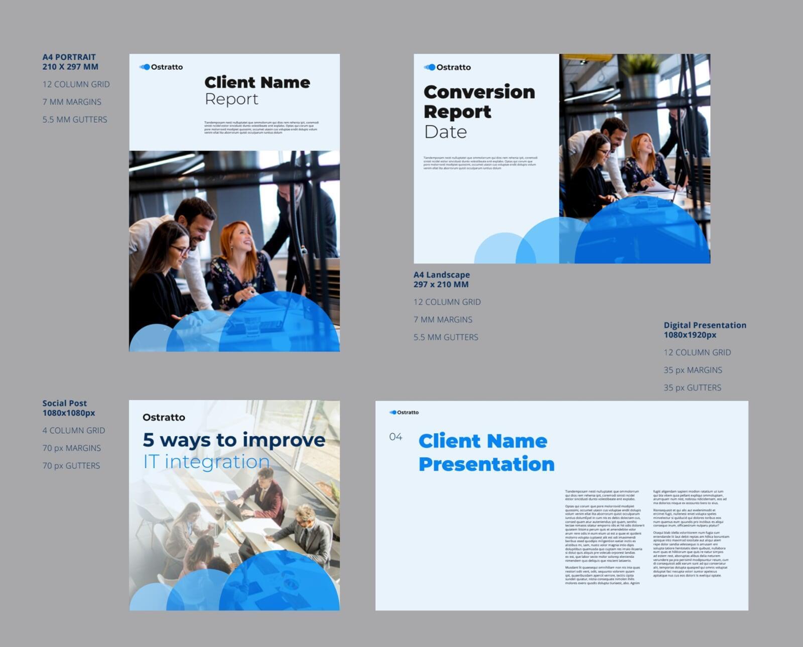
Grids are essential for maintaining structure and balanced proportions in Ostratto layouts. The following guidelines apply to all communication materials.
Margins
Use equal margins on all sides wherever possible. For printed double-page spreads, allow extra space in the middle to improve readability. While tight margins are a key part of Ostratto’s brand identity, slightly larger margins may be used for in-house printed materials such as stationery.
For digital interfaces, apply equal margins to the left and right sides only, with no margins at the top or bottom, ensuring a clean and balanced layout.
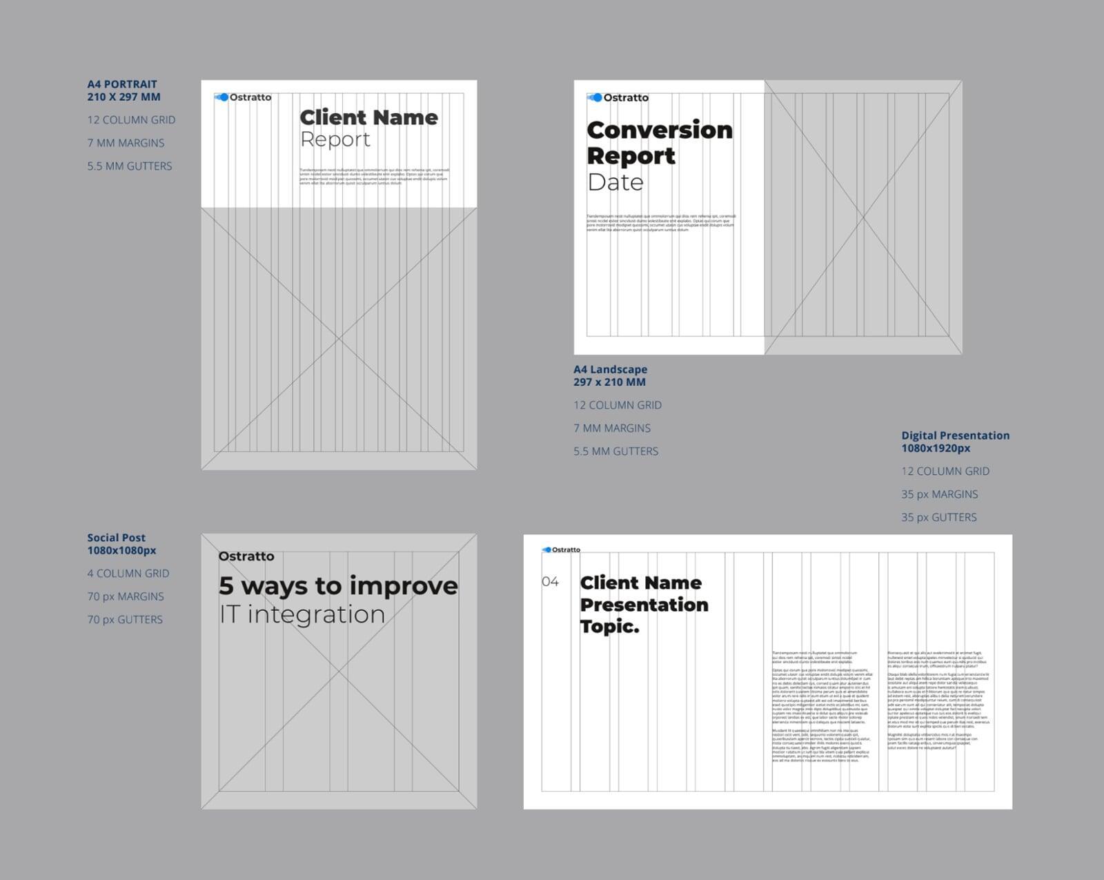
Columns & Gutters
Establish a consistent column structure for each layout. A twelve-column grid is a versatile starting point, easily divisible by 2, 3, or 4, allowing flexibility across different formats.
For A4 documents, a 5.5mm gutter provides balanced spacing. However, wider gutters may be necessary for digital layouts, such as presentations or social media materials, to enhance readability and visual clarity.
Tone of Voice
Logo | Colours | Typography | Layouts | Application | Usage Terms
A distinctive and consistent tone of voice ensures that customers and stakeholders recognise and connect with the Ostratto brand. It reflects who we are, what we stand for, and differentiates us from competitors.
Maintaining this consistency strengthens our relationship with customers, fostering trust, clarity, and engagement - helping them feel confident in our expertise and approach.
Trustworthy
Trustworthy
We are honest, approachable, and transparent. Every statement we make is backed by our experience and expertise, ensuring credibility and trustworthiness.
We never oversell or make false promises - we stick to the facts, providing clear, informative, and reliable communication that our customers can depend on. Our focus is always on delivering value with integrity and professionalism.
Professional
Professional
We communicate in a way that resonates with our stakeholders, customers, and partners, using clear and familiar industry terminology. Our approach is credible and experience-driven, but never overly formal or arrogant. We address challenges pragmatically, without exaggeration or unnecessary drama.
Our tone is always straightforward, professional, and helpful, ensuring that our messaging builds trust and inspires confidence in every interaction.
Customer-centric
Customer-centric
We're approachable and clear in our communication, using layman’s terms where appropriate while ensuring that every message remains insightful and impactful.
As experts, we simplify complex concepts, making our field of expertise accessible and easy to understand for our customers and stakeholders. We prioritise their needs, addressing their challenges and pain points with clarity, precision, and a solution-focused approach that drives meaningful results.
Ostratto is
General Writing Guides
- Use plain English
- Use UK English across all markets for consistency
- Use the active voice
- Be clear, direct, concise
- Use gender-neutral language
- Avoid formal language, industry jargon and clichés
- Avoid colloquial expressions
- Structure your content clearly
- Use informative headings
- Use only necessary abbreviations
- Avoid acronyms
- Avoid exclamation points if possible
- Let your enthusiasm speak through your words
- Avoid expressions that are too specific to your own culture
- Use a personal approach: communicate directly with your readers. When you write to the reader, use “you”
- Show, don’t tell
- Always remember Ostratto trust position: focus on expressing our values and building trust
- Stick to Ostratto's verbal personality and trust positioning – don’t simply repeat what our competitors are saying
Application
Logo | Colours | Typography | Layouts | Tone of Voice | Usage Terms
Consistency in branding extends beyond logos and colours - it applies to every touchpoint where Ostratto is represented. This section provides practical guidance on applying our brand identity across various formats, ensuring a cohesive and professional appearance in every interaction.
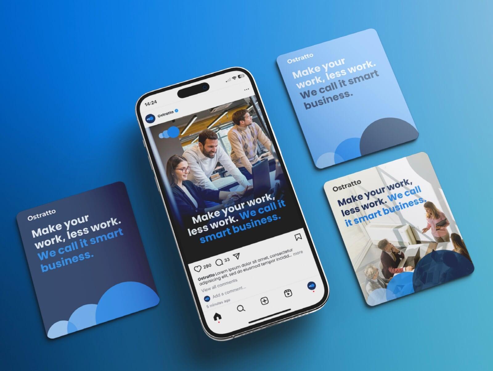
Posts
Email Footers
Stationary
ID Cards
Posts
Posts
Our social media communication templates ensure a consistent and professional brand presence across digital platforms. These layouts and designs can also be adapted for promotional, digital, and print materials, including newspaper and magazine advertisements, notepads, calendars, and other branded assets.
By maintaining a cohesive visual identity, we reinforce brand recognition and ensure every piece of content aligns with Ostratto’s high standards of clarity, professionalism, and engagement.
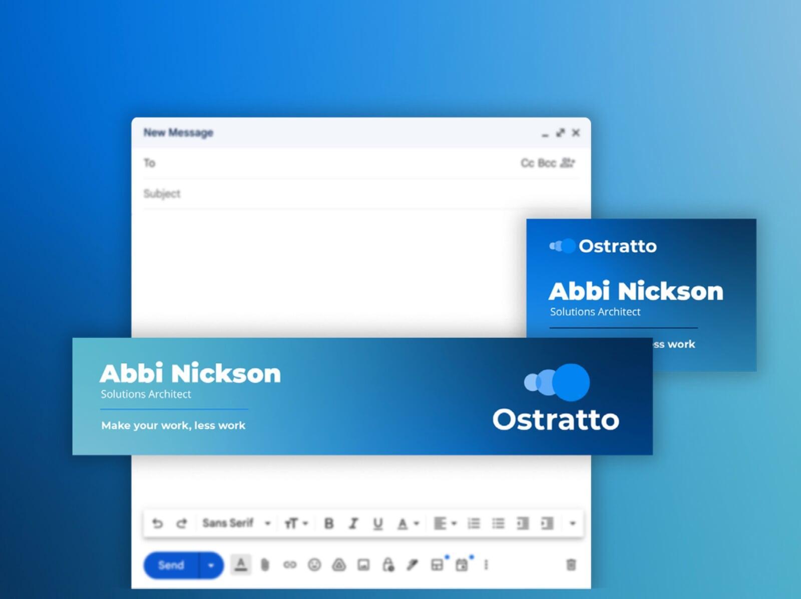
Email Footers
Email Footers
Our email footer designs incorporate Ostratto’s updated gradient and logo, creating a more prominent and visually consistent brand presence in digital communications. These footers ensure every email maintains a professional and cohesive look while reinforcing brand identity.
Both horizontal and portrait versions are available, allowing flexibility in application across different email formats. By following these guidelines, we enhance readability, clarity, and brand recognition in every interaction.
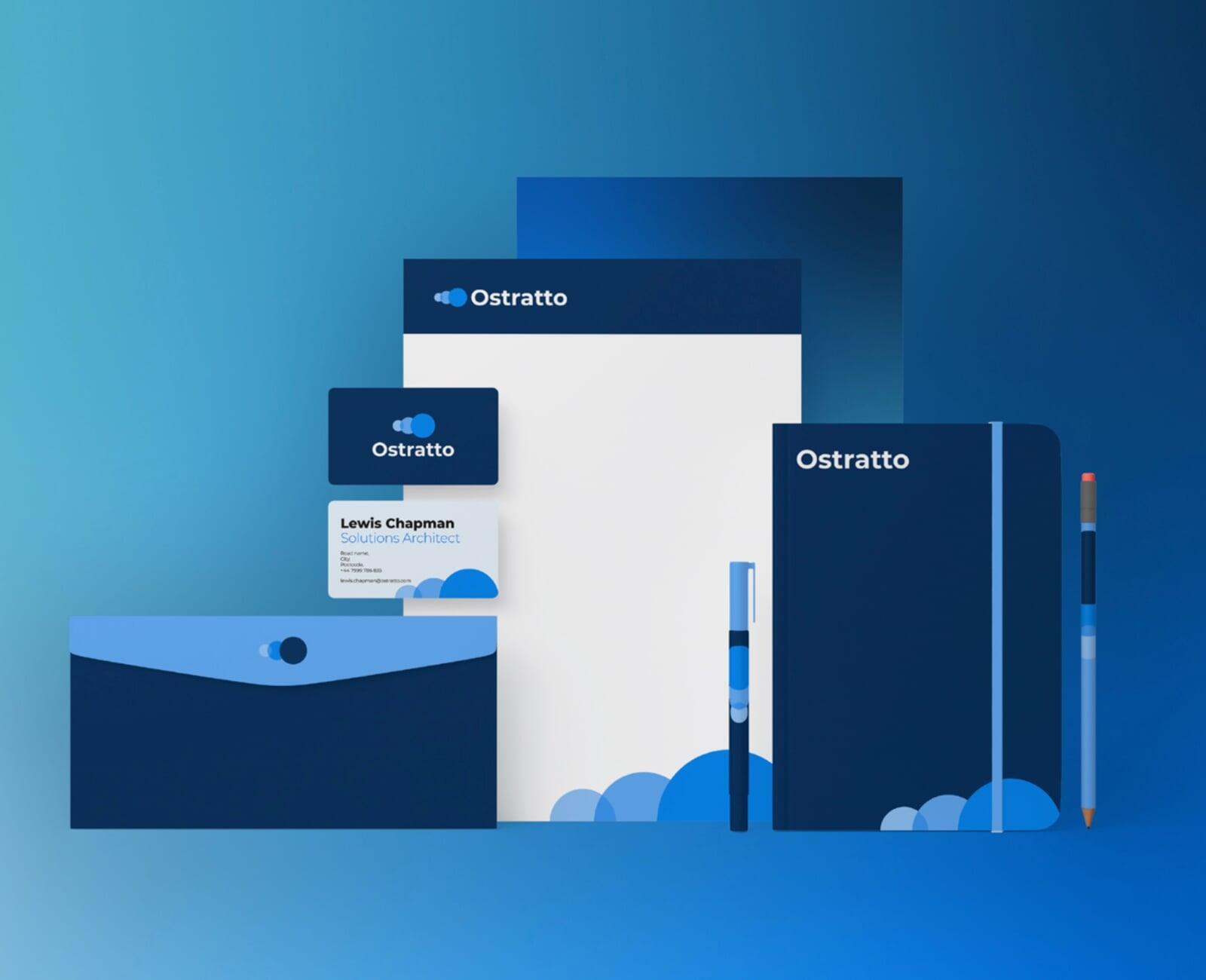
Stationary
Stationary
Our stationery designs ensure a polished and professional brand presence across all printed materials. This includes letterheads, envelopes, and business cards, each carefully designed to reflect Ostratto’s visual identity.
By incorporating our brand colours, typography, and logo, these assets create a consistent and recognisable look, reinforcing credibility in both internal and external communications.
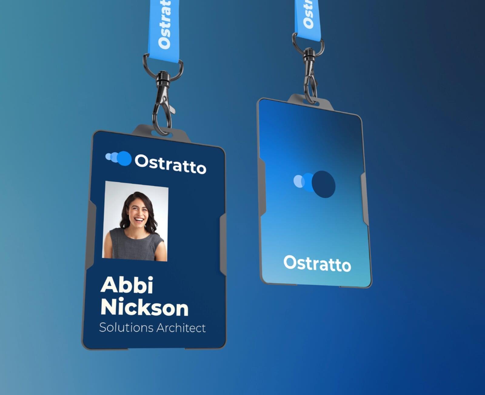
ID Cards
ID Cards
Ostratto’s ID card designs maintain a clean and professional aesthetic, ensuring team members are easily identifiable while upholding brand consistency. These cards feature our logo, typography, and brand colours, aligning with our visual identity.
Designed for clarity and professionalism, they provide a recognisable and unified look for employees, enhancing trust and security in both client interactions and internal settings.
Press Releases
When mentioning our company in press materials, please identify Ostratto as a technical consultancy and deployment company.
If announcements, blogs, or other communications go beyond the cases outlined above, or if you have questions about our guidelines, reach out to Ostratto's Partner Communications team.
Contact
For any legal inquiries around the usage of our assets, please contact our legal team.
For permission requests to use our assets, contact our marketing team.
Usage terms
Usage terms
The term "Marks" includes anything we use to identify our goods or services, including our names, logos, icons, and design elements. By using Ostratto's Marks, you agree that we own them and that any goodwill generated by your use benefits us.
Permission to use our Marks is limited in the following ways:
- Only use our Marks if they adhere to these brand guidelines.
- The permission we grant is non-exclusive (we can give it to others) and non-transferrable (you cannot give it to others).
- Do not feature our Marks more prominently than your own company's name or marks.
- We may update the guide, and changes must be made in accordance with our updates within a reasonable time.
- We can review the use of our Marks and require changes if needed.
- We may terminate permission to use our Marks at any time, and usage must stop promptly.